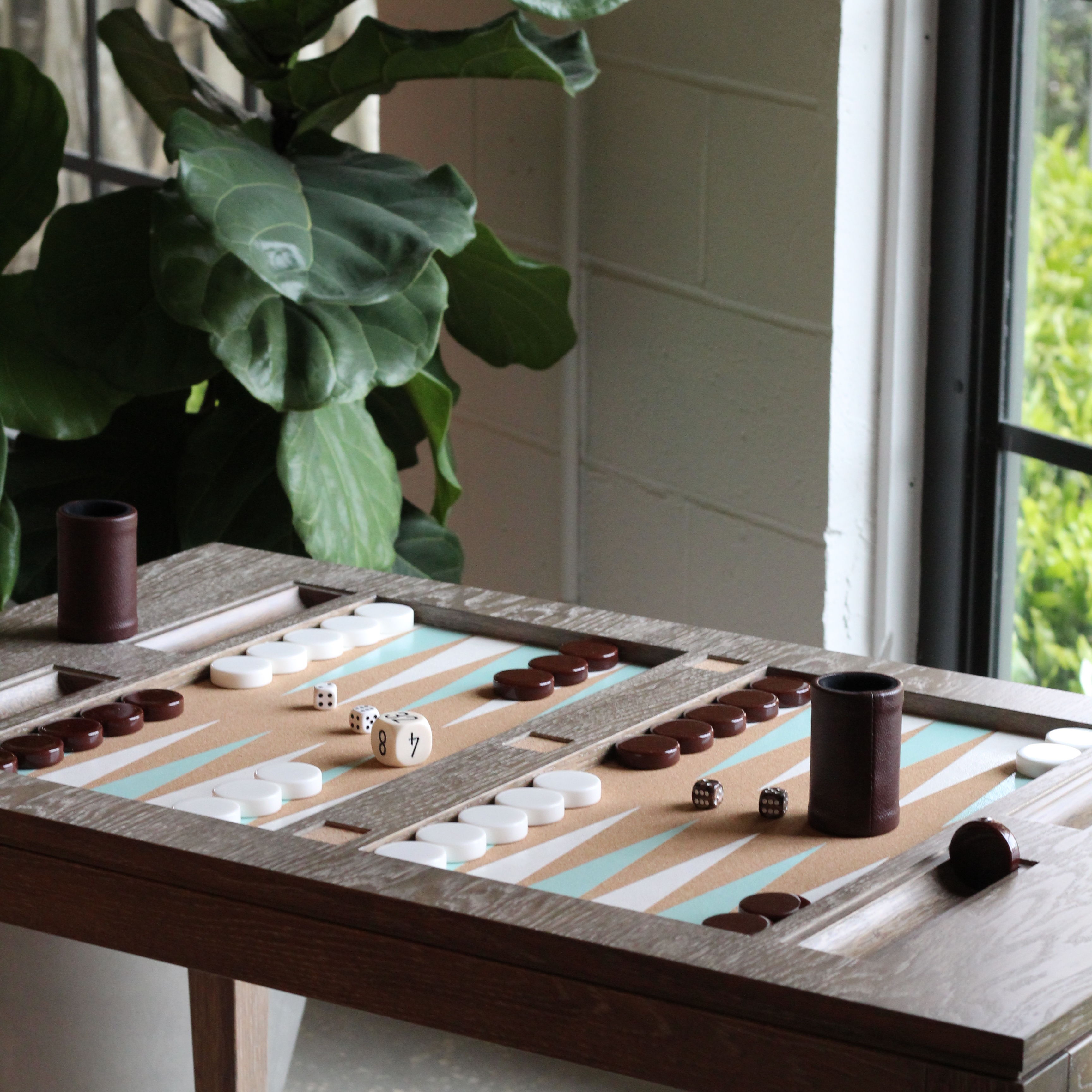


How to Use Color to Liven Up Any Room
Colorful furniture pieces, throws, table lamps and window treatments can make any space sing.
Image: Ryan Gamma
Considering how long the trend has persisted, one might say that the all-white-everything look went bold when the color of choice shifted to beige. From luxury units to prefab spaces, the gray or “greige” craze still seems to have a chokehold on many home interiors, offering neutral serenity with all the warmth of an abandoned prison.
But color is making a comeback, and what a relief. Pops and punches of color take rooms from flatline to hearts aflutter, imbuing character, a dash of intrigue and more.
“After the dark times of Covid, I think color can be healing,” says Ellen Hanson, an interior designer who splits her time between New York City’s Ellen Hanson Designs and a more recently established location in Burns Square called Pansy Bayou. “I think it brings people joy.”
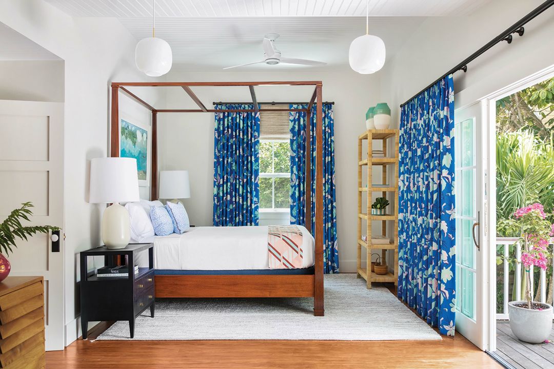
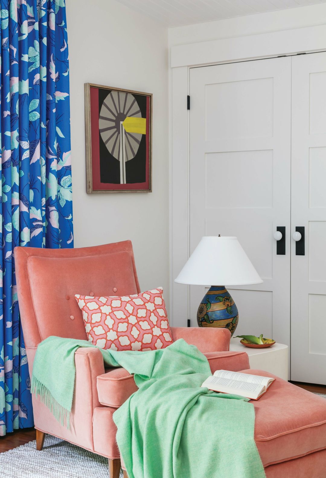
This patterned, full-length drapery adds a cheerful punch to natural wood browns. Pink and turquoise on the throw across the foot of the bed add color continuity.
Image: Carissa Warfield
Hanson is known for the seamless way that she balances colors and patterns. Her clients’ quest for color starts by finding a point of inspiration. “They’ll bring a picture of a painting or even a handbag in their favorite color,” she says.
Aside from safer colors like blue—which, spanning turquoise to navy, often garners universal admiration—choosing a color is personal. “Home-owners shouldn’t follow rigid rules, Hanson says. “I personally like earthy tones mixed with weird, acid greens.” “For Gulf Coast projects, we love citruses like strong yellow, lime greens and orange. I love orange because it feels invigorating.”
John Cugasi agrees. In his recent condo remodel in downtown Sarasota’s Dolphin Towers, orange chairs and an orange volume above the kitchen island add vibrancy. “I’m attracted to positive energy and it gives off that feeling,” he says.
Interior designer Keffie Lancaster, of Lancaster Interior Design, helped Cugasi make the shift from all gray and white. “I had found these cool orange chairs and I picked up their color, put it on the ceiling and it balanced the neutrals,” says Lancaster. “So it was a fun way to bring a little excitement to the space without being overbearing."
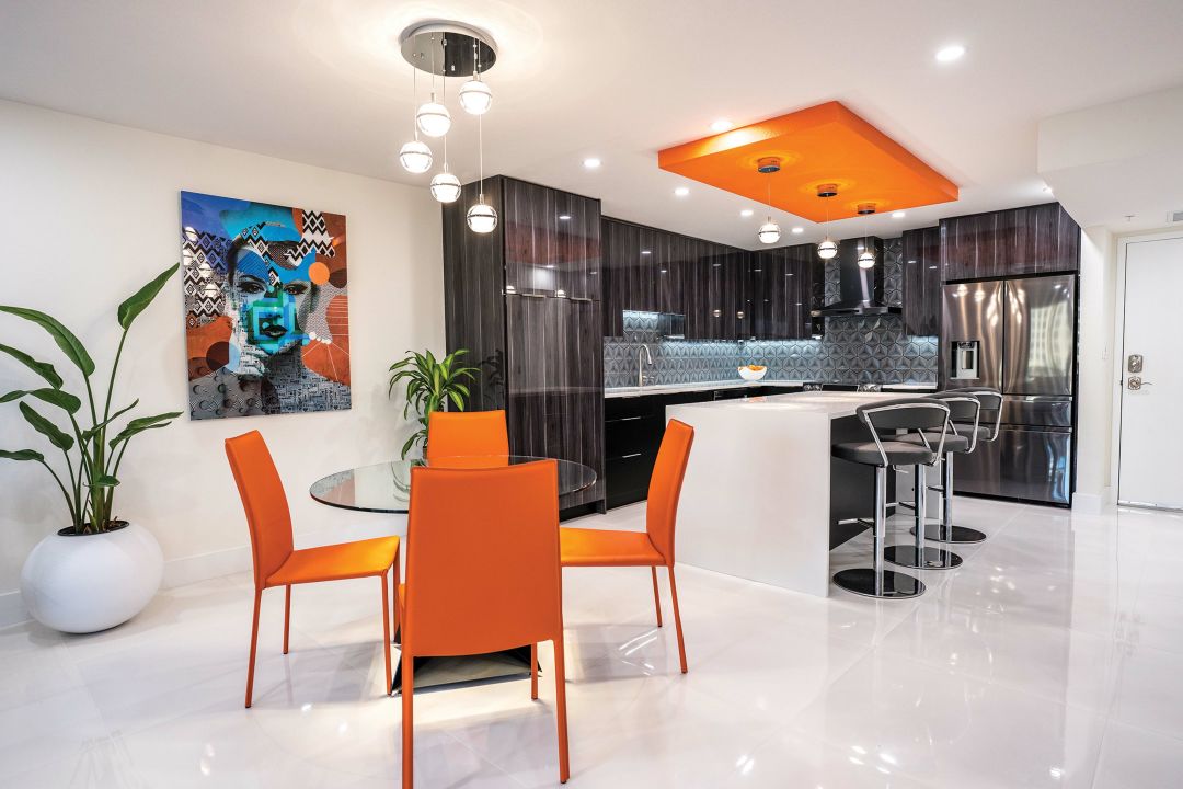
Vivid orange gives this room a fresh look.
Image: Carissa Warfield
There will always be color trends that trickle from fashion runways and Pantone’s color of the year. But what doesn’t shift is the way that different colors can arouse different emotions, bestowing a feeling of calm or movement. If you’re unsure where to start, Lancaster points to restaurant applications that can translate to the home.
“Think about fast food,” she says. “Its primary colors encourage a dine and dash experience, while colors at a steakhouse might be deeper, rich and relaxing.” She suggests thinking of a place where you’re usually relaxed. “When you think of a spa you love, you might have rich teaks and greens that make you think of the outdoors,” she says.
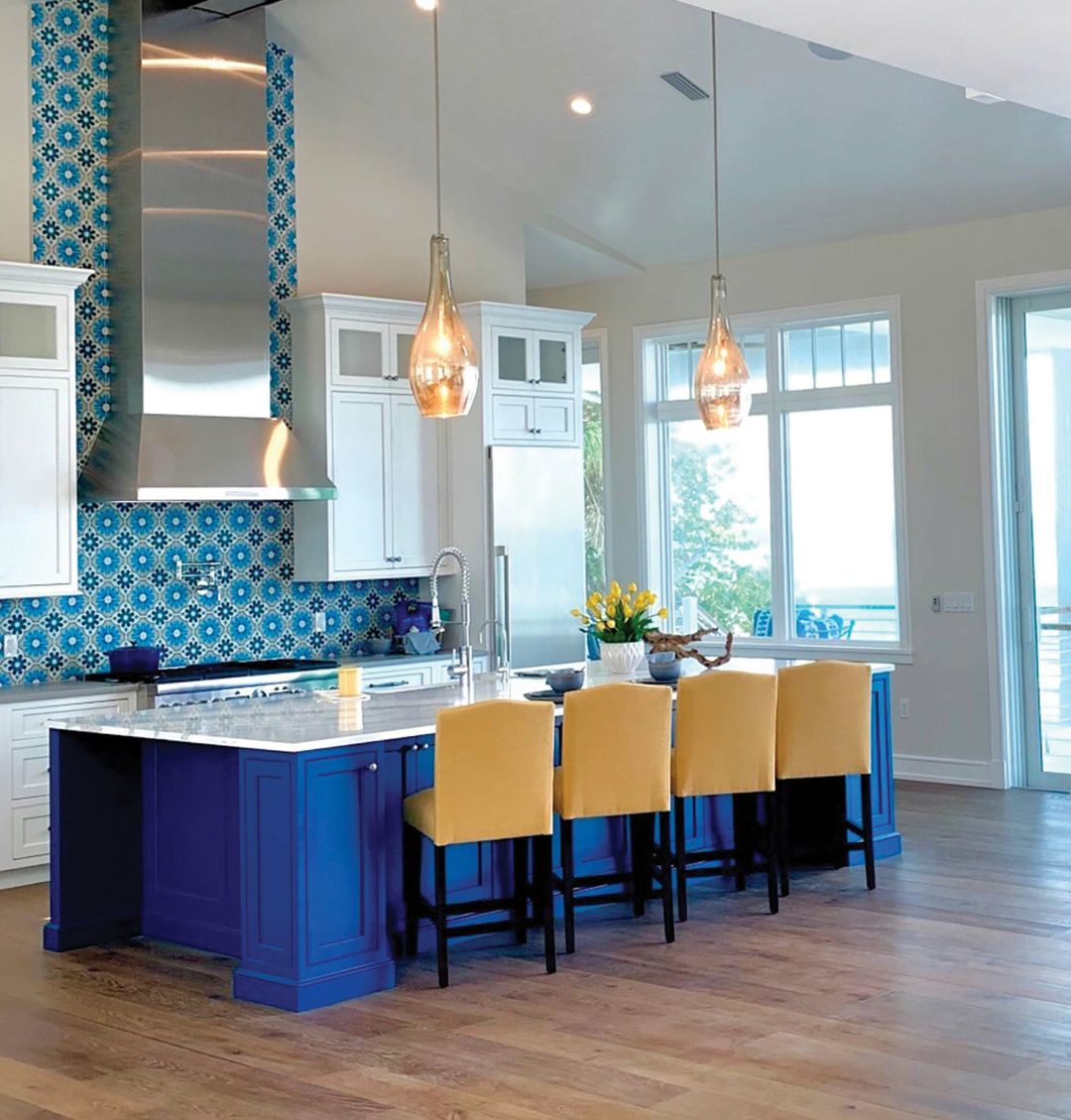
This vibrant blue kitchen island anchors the room, while a vintage-style backsplash travels up the wall. Yellow stools, pendants and fresh tulips pop against them.
Image: Courtesy Photo
Are some areas of the home better suited to color than others? Tanya Burley, of Tanya Burley Design, says kitchens are a place where many homeowners are leaving neutrals behind. “Hardly anyone is doing white cabinets anymore,” she says. One Anna Maria Island kitchen she recently designed sings thanks to its combination of blue and yellow.
Although Burley doesn’t think there should be any hard rules when it comes to color, she suggests choosing a main anchor color to start and then reiterating it throughout the home in small touches. “Your eye wants to catch a color three times,” she says. “So if you have a kitchen island in a color, for example, you want to make it happen two more times in the same space."
Hanson also sees value in threes and likes to come up with a color palette before any design project. “Pick three colors you respond to and keep using them throughout the home,” she says. “In one room, it might be on the rug. In another, on a wall with paint or art. Reuse the color in another modality.”
The best way to introduce a pop of color into your home depends on your budget and time. Not everyone can invest in all-new tile, for instance. But paint, throw pillows, picture frames, area rugs, throws, pots, drapery and bedding are places where you can spice things up quickly, with minimal expense. Burley suggests adding an ottoman or trims on drapery.
One color that Hanson approaches with caution is red. “Even in nature, it’s often a sign of aggression or signals a threat,” she says. But even that isn’t an ironclad law. “The minute you make a rule,” she says, “break it.”